Making an Arabic In-N-Out logo
I first heard about In-N-Out in Dubai, it was a pop-up store that opened weirdly for 4 hours during a weekday in a far away mall, apparently just to keep its trademark. Ever since I kept hearing about the hype of In-N-Out.
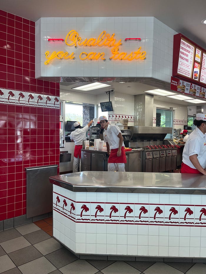
Several years later, I found myself on a beautiful memorable family trip from SF to LA via Route 1, passing by an In-N-Out near a small city under the summer fog of the West coast.

Inside the store in did feel like a typical retro American diner, which was nice for tourists like us.
I grabbed the Classic burger with fries —while I know the milkshake is also famous, I still can’t fathom a normal human eating all of the burger and fries PLUS a milkshake. Regardless, the burger was fine, the fries were bland. I sincerely believe that its own reputation killed its experience; it was good but too overhyped.
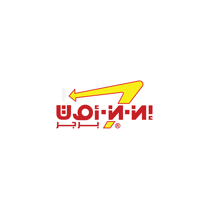
Anyways, I’m not a food reviewer. I’m here for the typography — I was allured with the logo’s simple typography and colours. And seeing how closely resembles my favourite Arabic font, Kufi, I thought it was a nice little challenge to try and Arabise it.


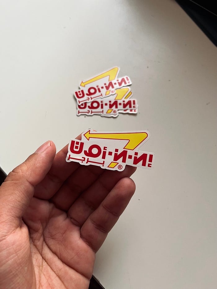
Overall, I was satisfied with the outcome in converting not only the logo but the (Kufi) type. Decided to print a few stickers as souvenirs.

